
Christmas Colour Palettes for Branding & Graphic Design
- Carla Campbell
- Dec 21, 2025
- 3 min read

Christmas colour palettes play a huge role in how seasonal branding is perceived. The right combination of tones can instantly signal warmth, nostalgia, or luxury, all before a customer reads a single word. As holiday marketing becomes increasingly visual-first, thoughtful color choices are more important than ever.
This article explores current Christmas colour palette trends and how designers, brands, and creatives can use them effectively across branding, packaging, social media, and digital design.
Why Christmas Colour Palettes Matter in Branding
Holiday campaigns are often short-lived, but the impression they make can last well beyond the season. Strong Christmas colour palettes help brands:
Create instant seasonal recognition
Stand out in crowded holiday marketing spaces
Evoke emotional responses like comfort, excitement, or nostalgia
Maintain brand consistency while still feeling festive
Rather than relying on overly saturated reds and greens, many modern brands are shifting toward more refined, intentional holiday palettes.
Christmas Colour Palette Trends to Watch

Neutral & Earthy Christmas Palettes
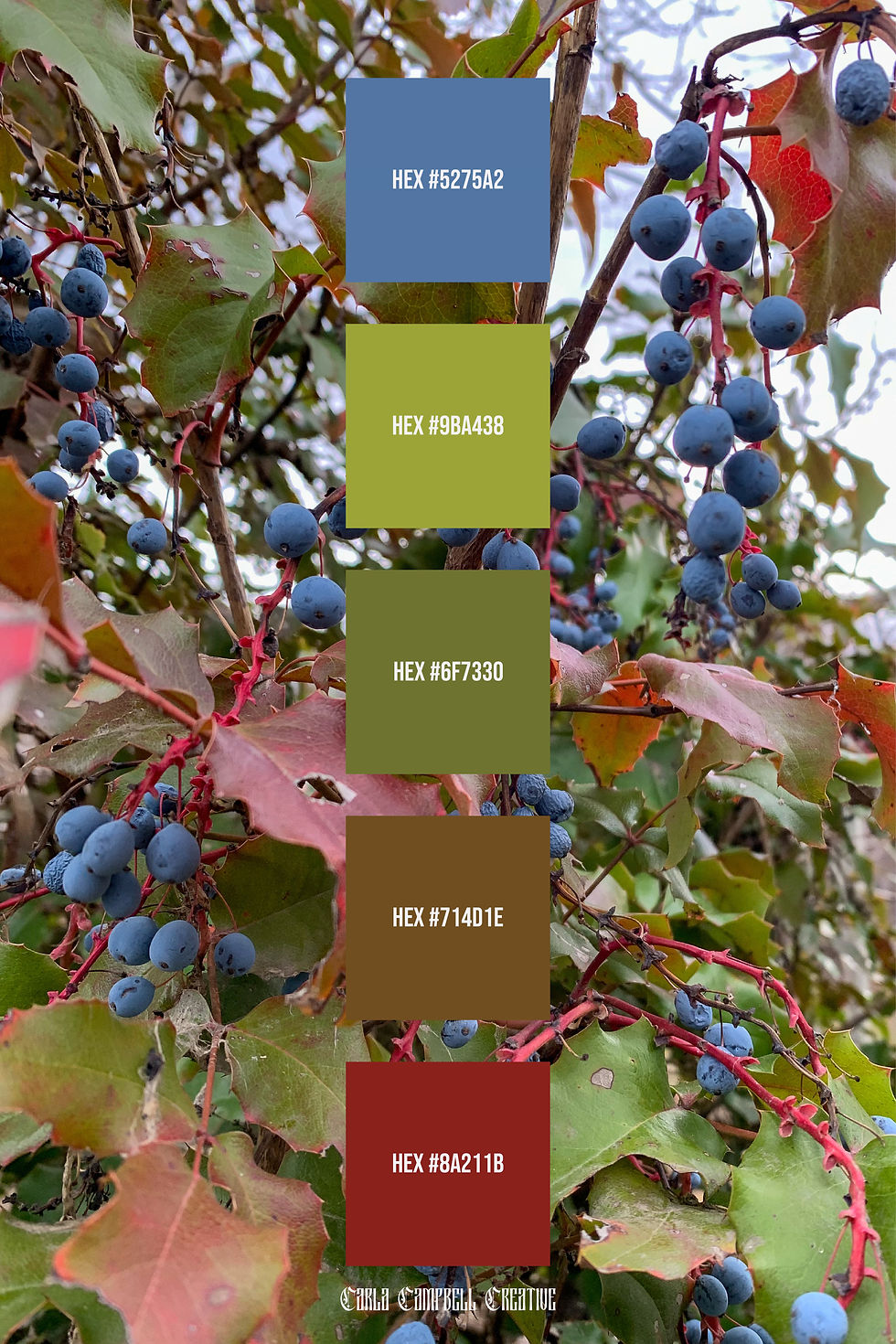
Neutral Christmas palettes are trending heavily in modern branding. Inspired by kraft paper, pine branches, stone, and natural textures, these palettes rely on warm browns, soft beiges, muted greens, and understated reds.
Best used for:
Minimalist holiday branding
Eco-conscious or lifestyle brands
Packaging and print design
Subtle seasonal website updates

Warm & Cozy Candlelight Palettes
Warm Christmas colour palettes draw inspiration from candlelight, firelight, and cozy winter interiors. Think soft golds, copper tones, warm reds, and deep browns that create an inviting, intimate feel.
These palettes are ideal for brands that want to evoke comfort, nostalgia, and warmth during the holiday season.
Best used for:
Holiday social media graphics
Seasonal email marketing
Boutique and handmade brands
Hospitality and lifestyle businesses

Modern Classic Red & Green Palettes
Traditional Christmas colours are making a comeback, but with a modern twist. Instead of bright primary red and green, contemporary palettes use deeper forest greens, muted reds, pine tones, and warm neutrals to elevate the classic look.
This approach keeps the holiday feel intact while aligning with modern design standards.
Best used for:
Established brands
Holiday campaigns with a timeless feel
Retail and product-focused businesses
Seasonal branding extensions
How to Choose the Right Christmas Palette for Your Brand
When selecting a holiday colour palette, consider how it aligns with your existing brand identity. A strong Christmas palette should complement your core colours, not replace them entirely.
Ask yourself:
Does this palette reflect my brand values?
Will it translate well across digital and print platforms?
Does it feel seasonal without overwhelming my brand identity?
Nature-inspired and muted holiday palettes tend to perform best because they feel intentional and adaptable.
Using Christmas Colour Palettes Across Platforms
To maximize impact, apply your holiday palette consistently across touchpoints:
Website banners and landing pages
Social media and Pinterest graphics
Packaging and promotional materials
Email headers and campaign visuals
Consistency helps reinforce recognition and creates a cohesive seasonal experience.
Explore More Seasonal Colour Inspiration
All Christmas colour palettes featured here are original designs created to support designers, small businesses, and creatives seeking thoughtful seasonal color inspiration. Each linked palette post includes full colour breakdowns and HEX codes for easy use across branding, digital design, and marketing projects. New palettes and seasonal collections are added regularly. If you’re interested in custom holiday branding or a tailored seasonal colour palette for your business, feel free to get in touch.
All palettes featured are original designs by Carla Campbell Creative.


Comments