
Winter 2026 Colour Palette Trends Designers Are Using
- Carla Campbell
- Jan 5
- 3 min read


Graphic design colour trends for Winter 2026 are moving away from harsh contrast and overly cool minimalism, and toward something more grounded, emotional, and intentional. Designers are leaning into warm neutrals, cozy earth tones, cool modern blues, and deep moody accents to create work that feels calm, confident, and timeless.
In this post, we’ll break down the six Winter 2026 colour palettes designers are saving and using most, explain why they work, and show how to apply them across branding, web design, and visual identity systems.
This article also serves as a hub for the Winter 2026 colour palette pins you’ll find linked throughout Pinterest.
Why Colour Matters More Than Ever in Winter 2026 Design
As brands compete for attention across increasingly minimal digital spaces, colour has become one of the strongest emotional differentiators. Winter 2026 colour trends reflect a broader shift toward:
Comfort over shock value
Longevity over fast trends
Emotional warmth balanced with modern restraint
Instead of one dominant trend, Winter 2026 is defined by contrast in temperature. You will see warm versus cool palettes used strategically depending on brand tone and audience.
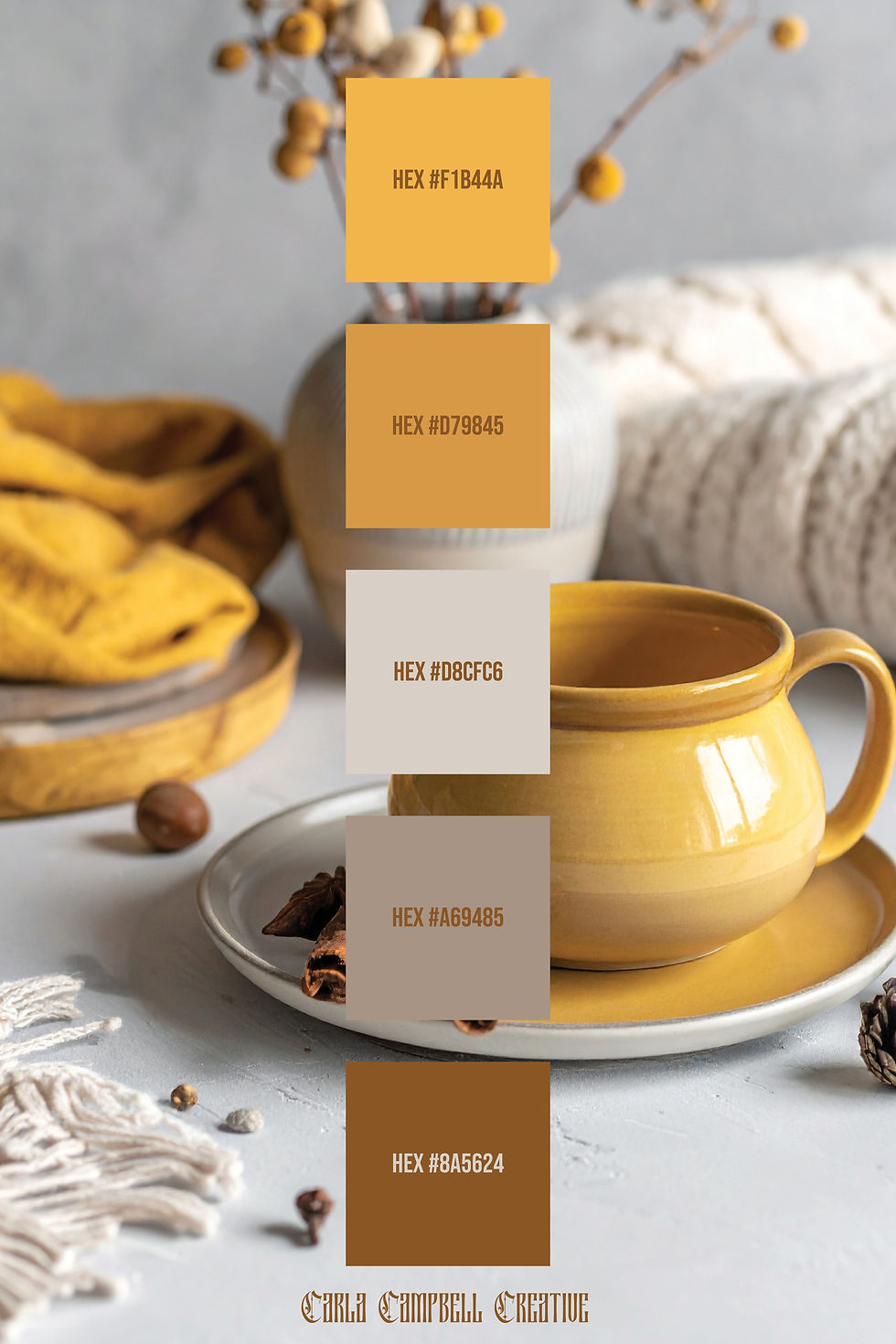
Warm Winter Colour Palettes: Cozy, Grounded & Timeless
Warm winter palettes dominate branding and lifestyle design for Winter 2026. These palettes feel human, tactile, and reassuring making them ideal for brands that want to communicate trust, comfort, and authenticity.

Use this palette for:
Brand identities
Logo design
Packaging
Lifestyle and wellness brands
Earthy browns, soft creams, and warm taupe's are especially effective for brands aiming to feel established, premium, or emotionally grounded.

This palette leans slightly softer, making it ideal for lifestyle visuals, social media branding, and seasonal campaigns that need warmth without heaviness.
Minimal Neutrals: Clean, Calm & Highly Versatile
Minimal neutral palettes remain a staple for Winter 2026 — especially in web design, editorial layouts, and modern brand systems. These palettes prioritize clarity and balance while still feeling seasonally relevant.

Minimal neutrals are particularly effective when paired with strong typography and intentional spacing. They allow content to breathe while maintaining a refined winter aesthetic.
Cool Winter Colour Palettes: Modern, Calm & Refined
While warm tones dominate, cool winter palettes are equally important for Winter 2026, especially for brands that want to feel modern, editorial, or tech-forward.

Cool palettes create emotional distance in a good way — signalling clarity, confidence, and professionalism. They work beautifully for:
Editorial design
Corporate branding
Digital products
Print layouts
Warm Accent Colours: Adding Depth Without Overpowering
Accent colours play a key role in Winter 2026 palettes. Rather than bright pops, designers are choosing muted warm accents that add personality without overwhelming the design.
These palettes are best used sparingly, as call-to-action colours, highlights, or secondary brand elements in order to create contrast while staying cohesive.
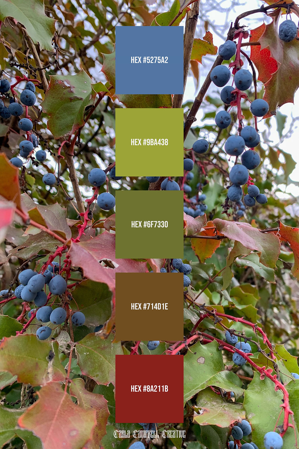
Deep & Moody Winter Palettes: Luxury and Statement Design
For brands that want to stand out, deep winter colour palettes are a defining Winter 2026 trend. Rich burgundy, rust, and dark neutrals signal luxury, confidence, and depth.

These palettes are particularly effective for:
Luxury brands
Fashion and beauty
Creative studios
High-end packaging
Warm vs Cool Winter Colour Palettes: Which Should You Choose?
One of the most important design decisions in Winter 2026 is colour temperature.
Warm winter palettes feel inviting, emotional, and grounded
Cool winter palettes feel calm, modern, and editorial
Your choice should always align with your brand’s personality, audience, and application, not just trends. Many designers are combining both within larger brand systems, using warm tones for emotional touchpoints and cool tones for structure and clarity.
Final Thoughts: Designing with Winter 2026 Colour Trends
Winter 2026 colour trends are less about rules and more about intention. The most successful palettes balance:
Warmth and restraint
Comfort and clarity
Timelessness and modernity
Whether you’re building a brand identity, refreshing a website, or creating seasonal content, these six Winter 2026 colour palettes provide a strong foundation for thoughtful, future-focused design.
👉 Save the related pins on Pinterest to reference these palettes later and explore how designers are applying them across real-world projects.


Comments