
Nature-Inspired Colour Palettes for Branding & Graphic Design
- Carla Campbell
- Dec 18, 2025
- 2 min read

Colour is one of the most powerful tools in branding and visual design. The right colour palette can instantly communicate mood, values, and personality often before a single word is read. That’s why nature-inspired colour palettes continue to be a leading design trend across branding, digital design, and social media.
In this post, I’m sharing a curated collection of original colour palettes inspired by natural landscapes, such as forests, mountains, stone, sky, and earth. These palettes are designed specifically with branding, graphic design, and digital creatives in mind.
Why Nature-Inspired Colour Palettes Work
Nature-based palettes feel grounded, timeless, and versatile. Unlike trend-heavy neon or ultra-saturated schemes, organic colours tend to age well and adapt easily across platforms.
Designers and brands tend to gravitate toward nature-inspired palettes because they:
Feel authentic and emotionally grounded
Work well across digital and print design
Pair beautifully with minimalist and modern typography
Support brand storytelling and visual cohesion
Whether you’re building a brand identity,
designing social media graphics, or creating a mood board, these palettes provide a strong foundation.
How to Use These Colour Palettes
Each palette featured on this site includes carefully selected HEX codes, making them easy to apply across creative projects.
You can use these palettes for:
Brand identity and logo design
Website and UI design
Social media templates and Pinterest graphics
Packaging and editorial layouts
Mood boards and creative direction decks
All palettes are designed to be flexible. They can be used as-is or as inspiration and adjusted to suit your brand’s needs.
Featured Colour Palette Themes

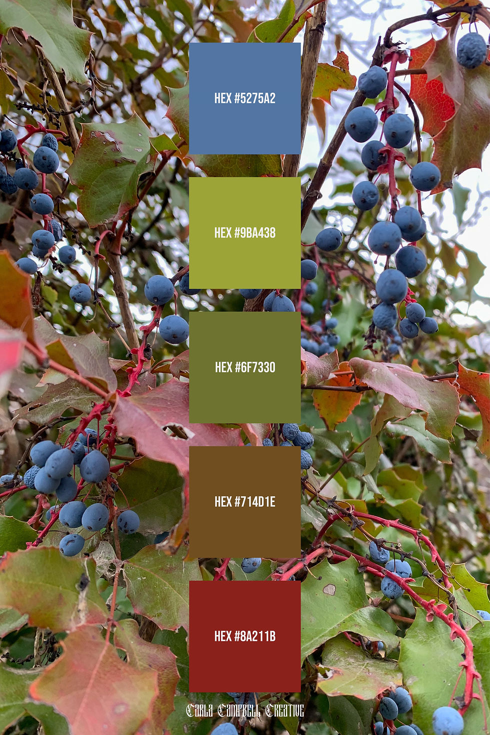
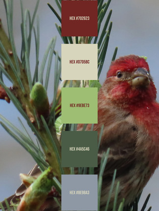
Earthy & Forest-Inspired Palettes
Inspired by moss, bark, stone, and woodland landscapes, these palettes feature muted greens, warm browns, and soft neutrals. They work especially well for eco-conscious brands, lifestyle businesses, and outdoor-focused companies.
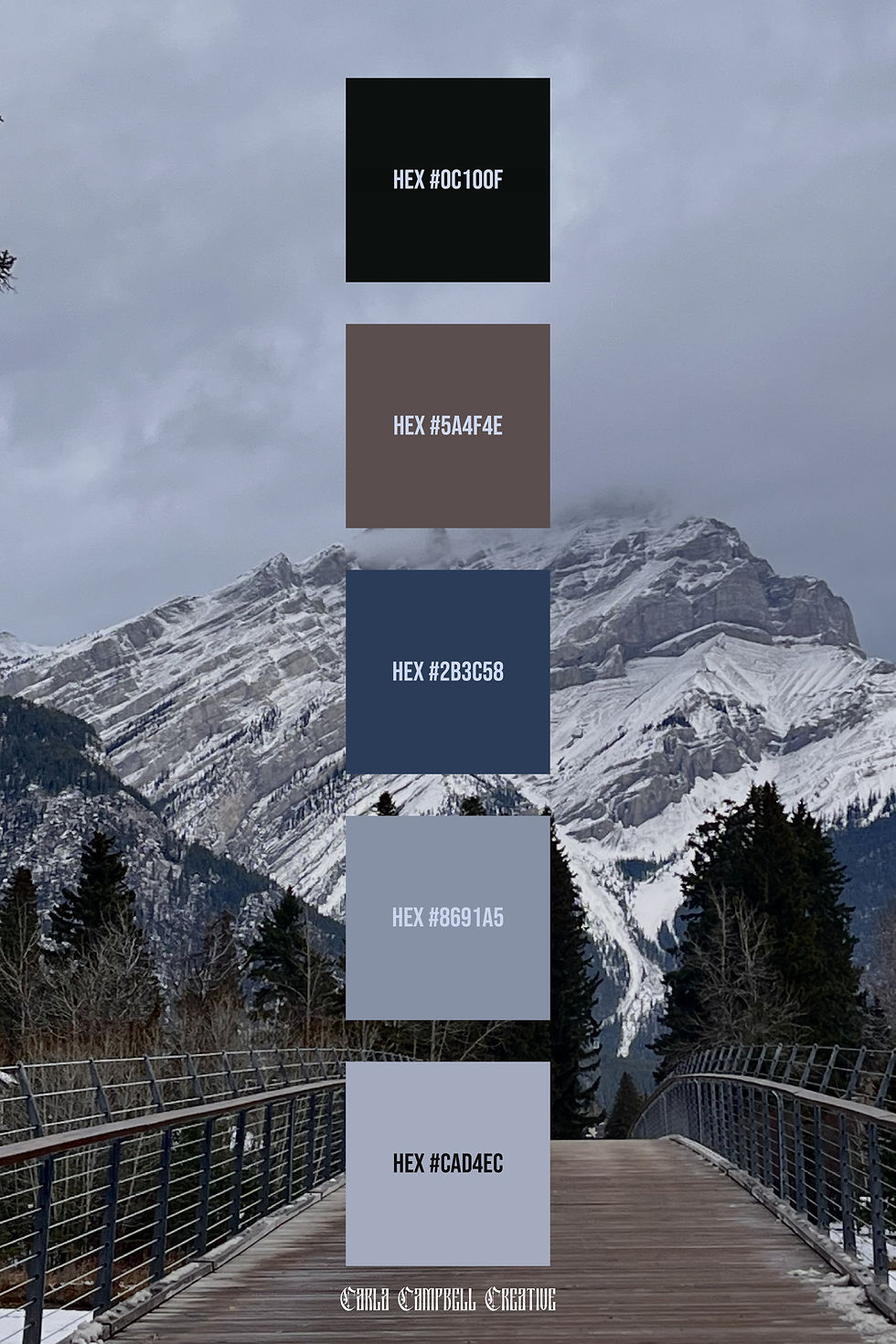
Mountain & Cool Neutral Palettes
These palettes pull from alpine scenery, overcast skies, and rocky terrain. Expect cool blues, soft grays, and deep charcoals. These are ideal for modern branding, editorial design, and clean digital interfaces.

Organic Neutrals & Muted Tones
Soft beige, clay, stone, and weathered neutrals form palettes that feel understated and refined. These are perfect for brands that want a calm, elevated aesthetic without overpowering colour.
Using Colour Strategically in Branding
A successful brand palette balances emotion and usability. When choosing colours, consider:
Contrast and readability
How colors translate across screens
Emotional tone and brand values
Longevity beyond short-term trends
Nature-inspired palettes excel here because they tend to feel both current and enduring.
Explore the Full Collection
Each colour palette on this site is part of an ongoing, original collection created to support designers, small businesses, and creatives looking for thoughtful color inspiration.
Browse the palettes, save your favorites, and reference them in your next creative project. New palettes are added regularly.
If you’re interested in custom branding or colour palette development tailored specifically to your business, feel free to get in touch.
All palettes featured are original designs by Carla Campbell Creative.


Comments